For the second installment of River Mouth, the stakes were raised. Coinciding with the City of Mississauga’s 50th Anniversary, the festival expanded from a single-day event into a month-long, multi-venue series. The challenge was to evolve the brand visual language to honor this "Golden Year" while keeping the core identity intact.
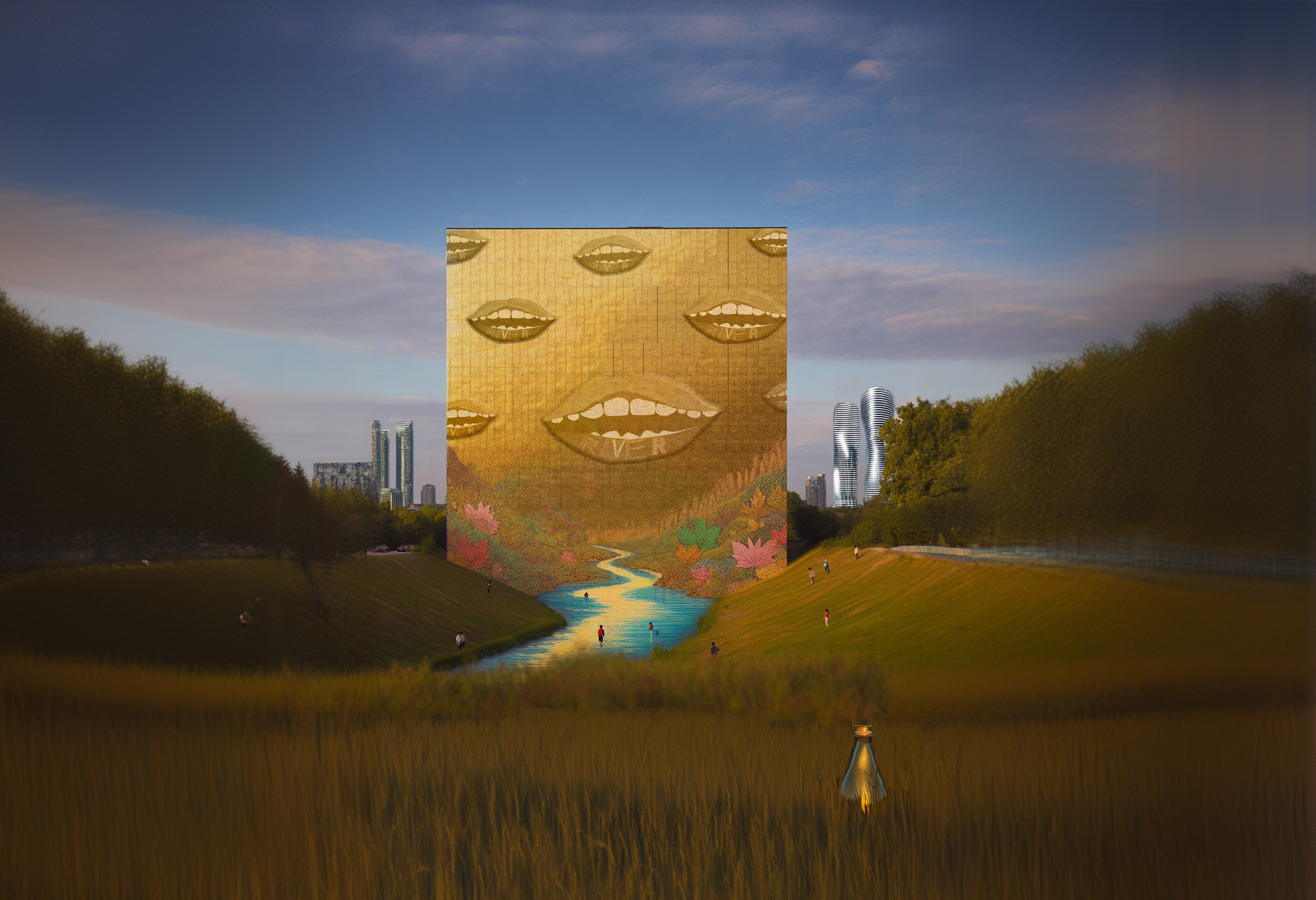
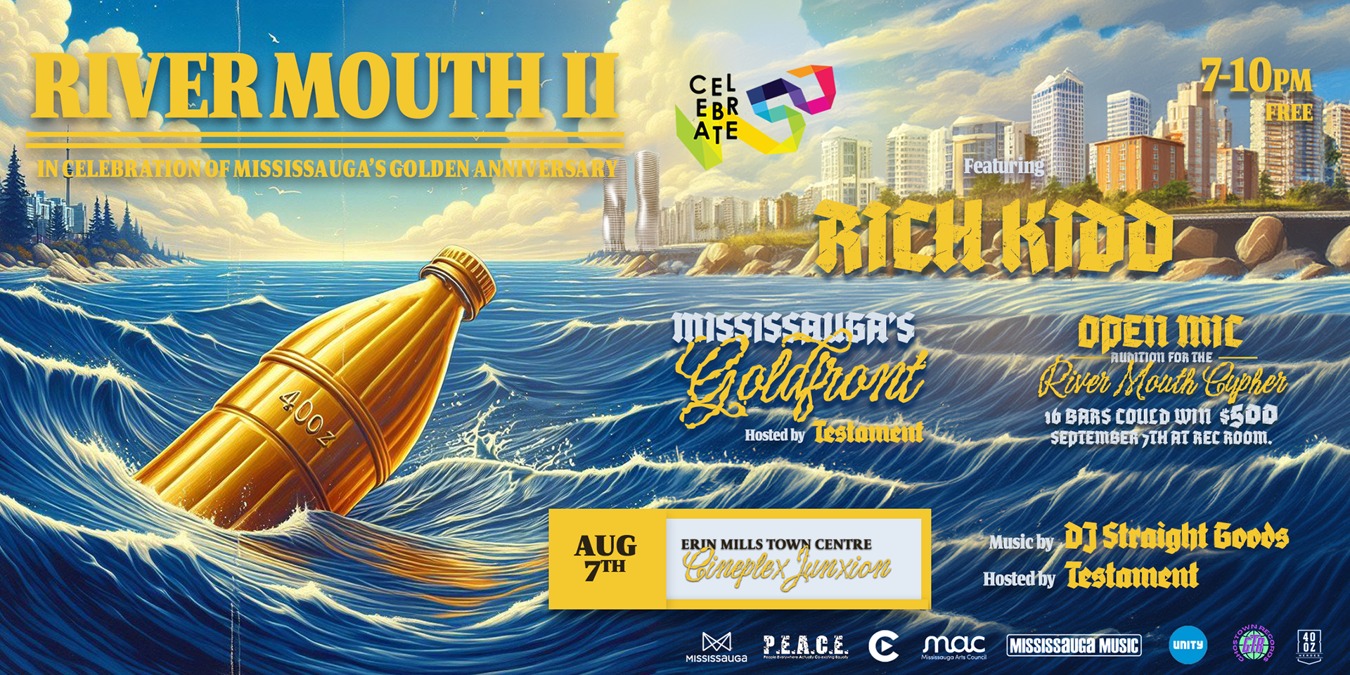
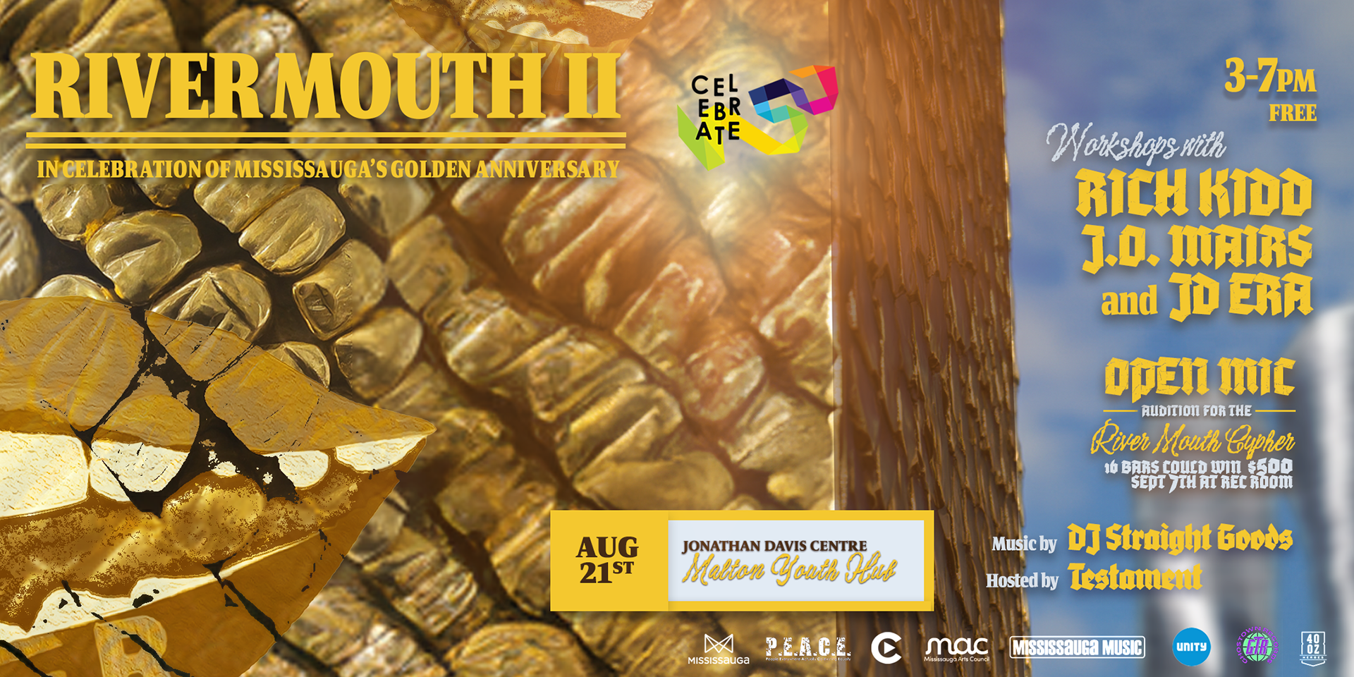
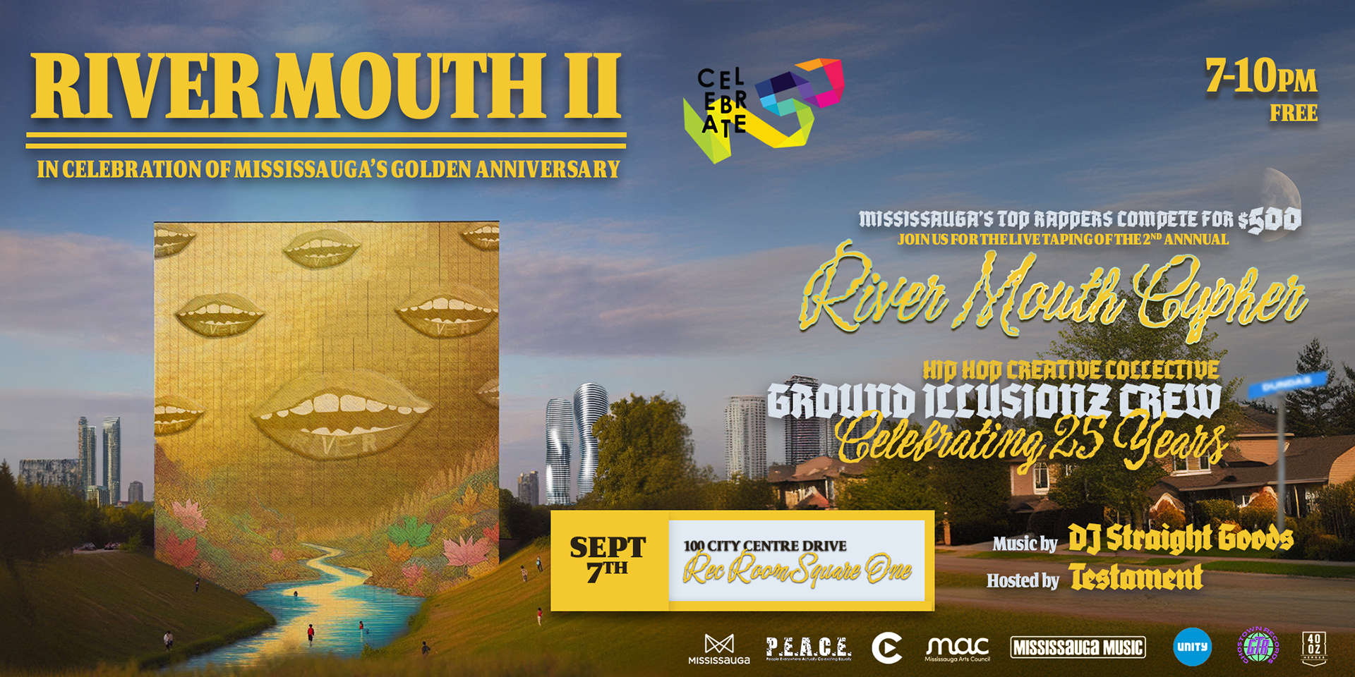
I developed the "Midas Touch" concept, reimagining our signature surrealist aesthetics dipped in gold. The original blue water textures were contrasted with striking gold elements—a floating gold 40oz bottle and a massive golden monolith set against a hyper-realistic Mississauga landscape.
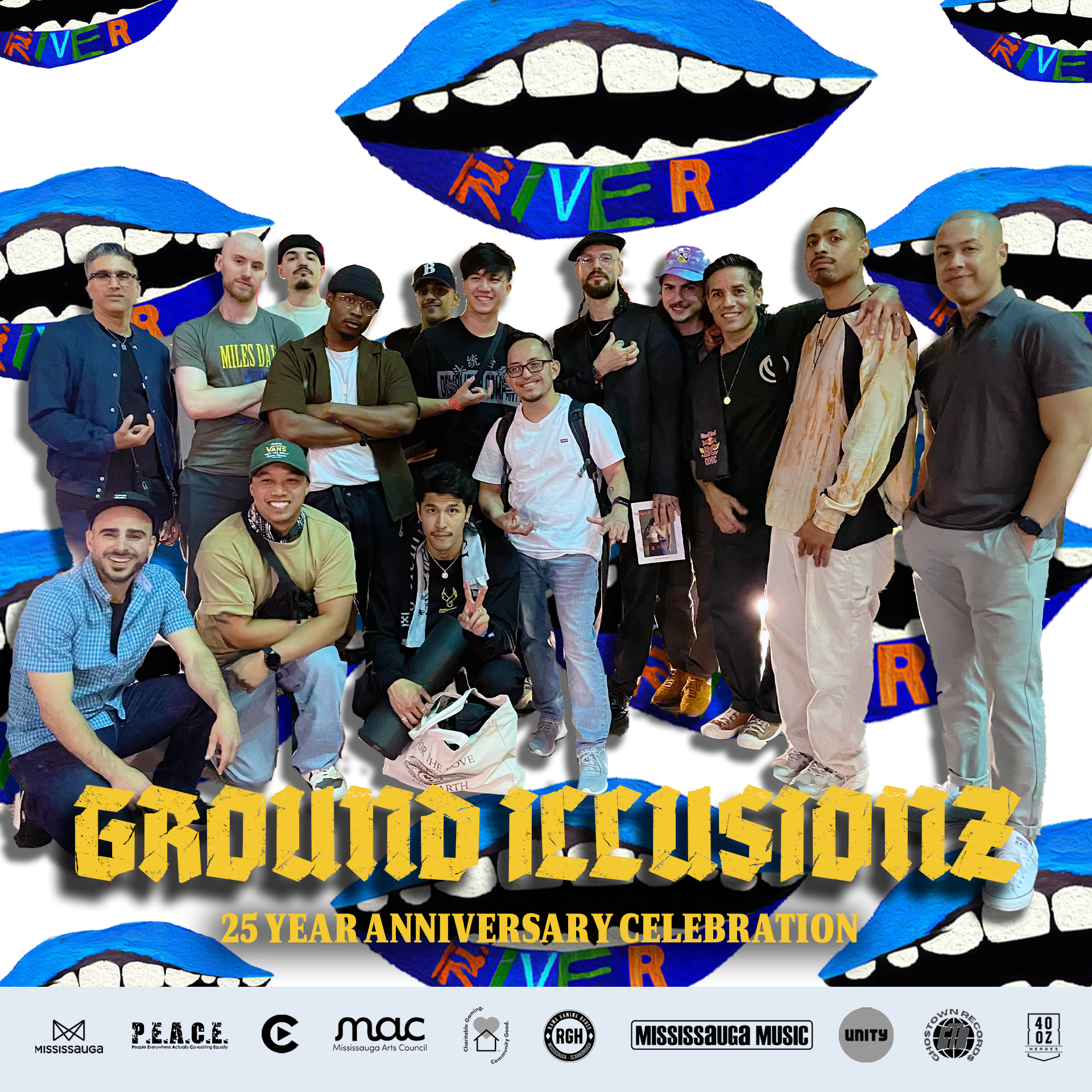
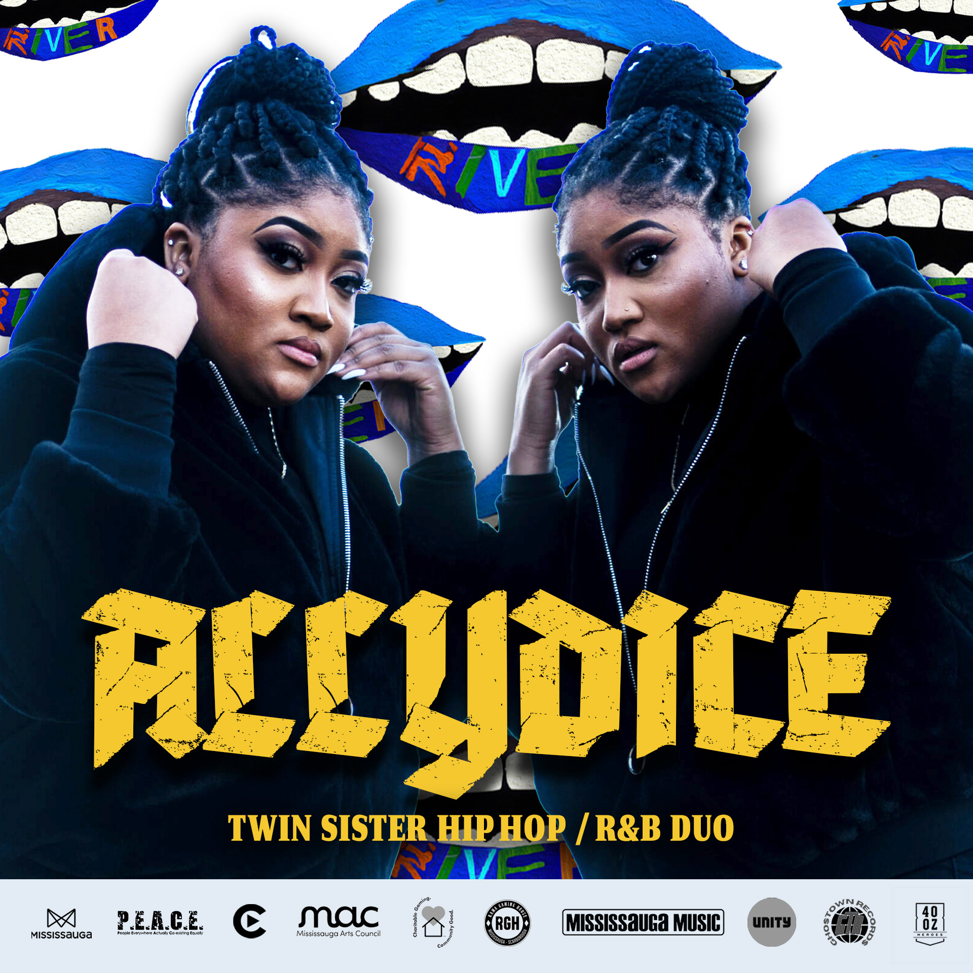
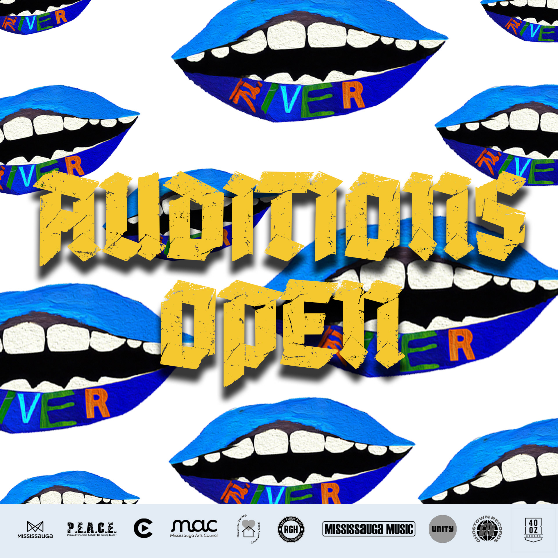
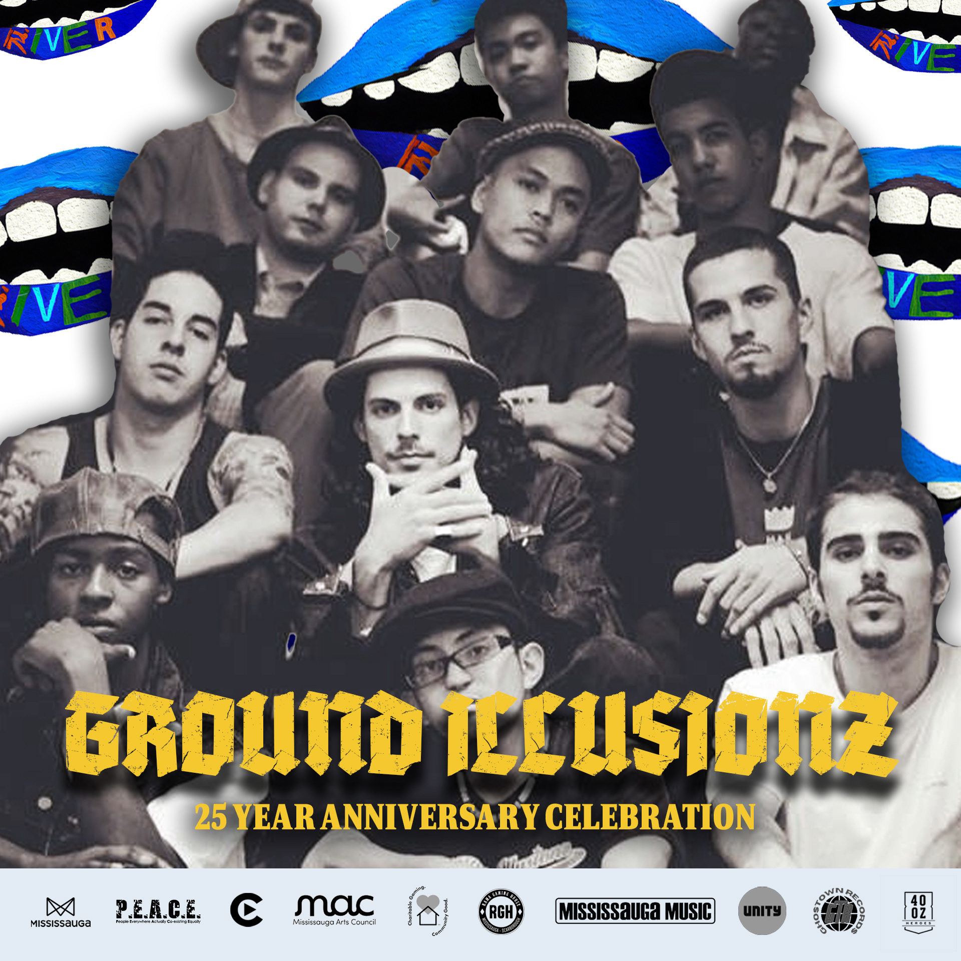
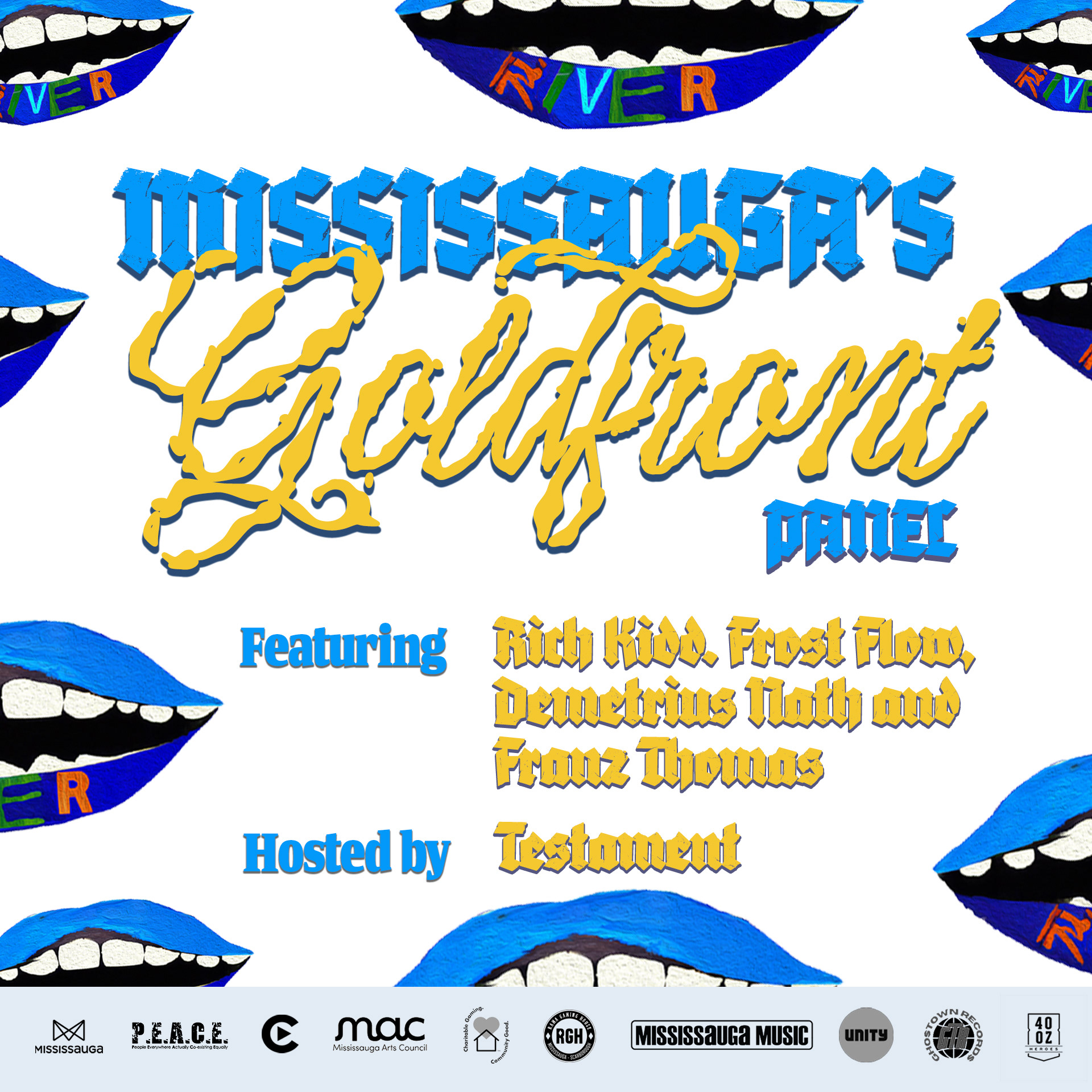
This campaign required a complex information hierarchy to promote three distinct activations across the City.
Key Deliverables:
The "Golden" Design System:
A complete re-skin of the brand assets using gold textures and surrealist compositing (e.g., the "Monolith" poster).
Multi-Venue Campaign: A modular poster layout designed to clearly communicate dates, locations, and programming for three separate events simultaneously.
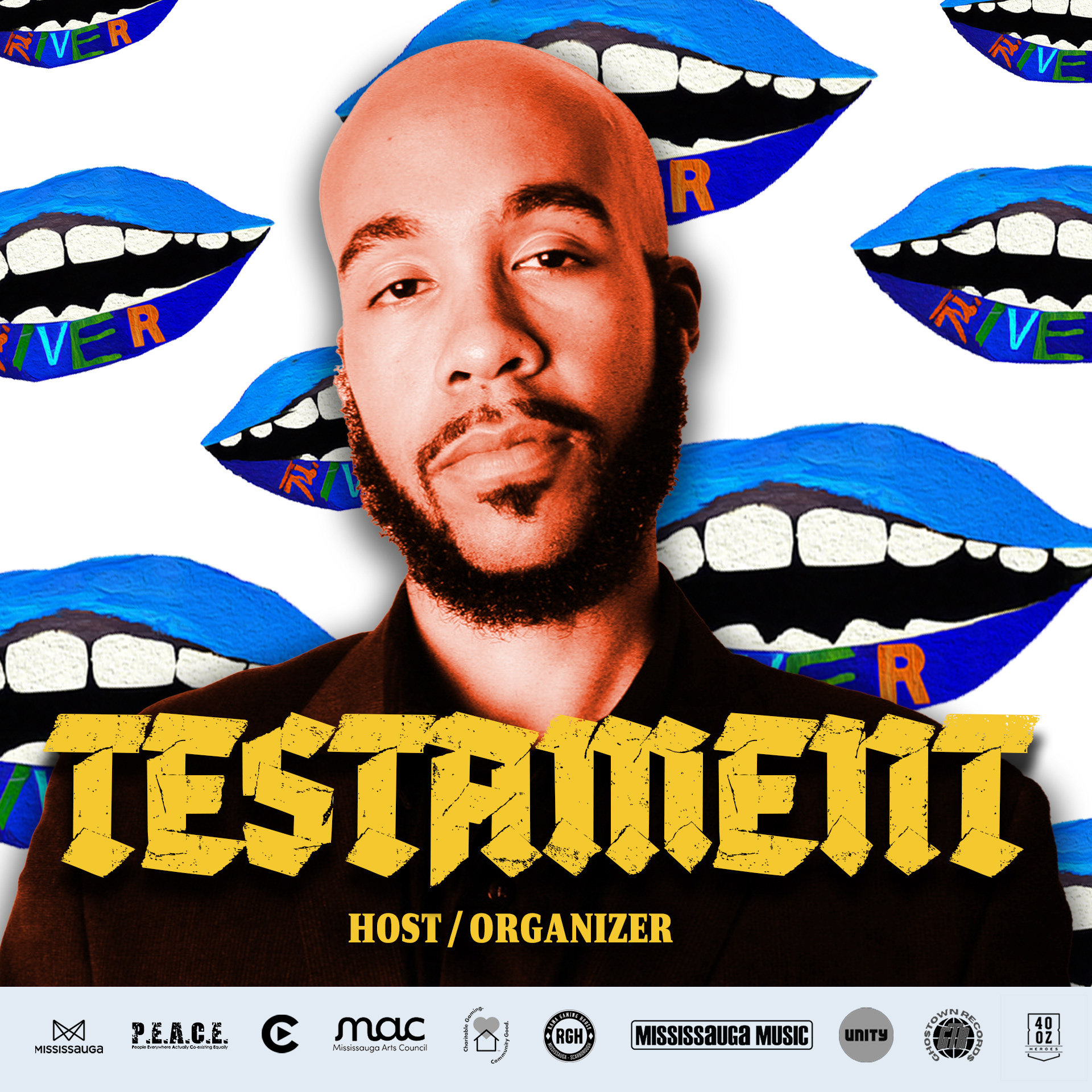
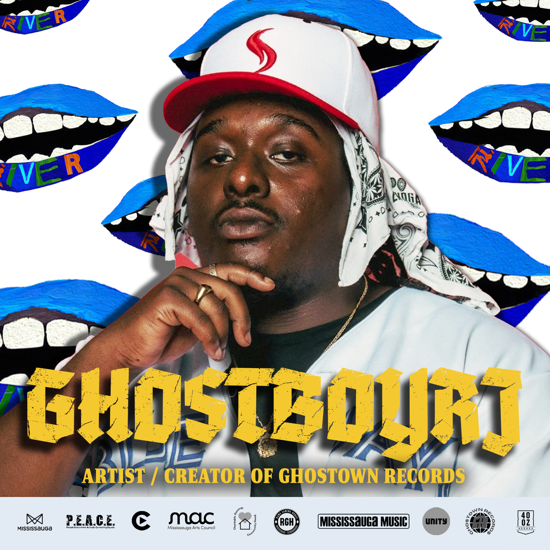
Strategic Partnerships: Visually integrating logos from major municipal partners (Mississauga Music, MAC, City of Mississauga) without compromising the artistic integrity of the hip-hop aesthetic.
The Outcome
River Mouth II successfully positioned the festival as a key cultural partner in Mississauga’s 50th Anniversary celebrations. The bold "Golden" aesthetic stood out in a crowded summer event calendar, driving attendance to all three venues. By expanding into Malton for youth workshops and partnering with Cineplex for the auditions, the festival proved it could scale beyond a single room. This edition solidified River Mouth not just as a party, but as a developing cultural franchise with the flexibility to adapt its theme year after year.